09. Clustered Bar Charts
L4 091 Clustered Bar Charts V4
Data Vis L4 C09 V1
Clustered Bar Charts
To depict the relationship between two categorical variables, we can extend the univariate bar chart seen in the previous lesson into a clustered bar chart. Like a standard bar chart, we still want to depict the count of data points in each group, but each group is now a combination of labels on two variables. So we want to organize the bars into an order that makes the plot easy to interpret. In a clustered bar chart, bars are organized into clusters based on levels of the first variable, and then bars are ordered consistently across the second variable within each cluster. This is easiest to see with an example, using seaborn's countplot function. To take the plot from univariate to bivariate, we add the second variable to be plotted under the "hue" argument:
Example 1. Plot a Bar chart between two qualitative variables
Preparatory Step 1 - Convert the "VClass" column from a plain object type into an ordered categorical type
# Types of sedan cars
sedan_classes = ['Minicompact Cars', 'Subcompact Cars', 'Compact Cars', 'Midsize Cars', 'Large Cars']

# Returns the types for sedan_classes with the categories and orderedness
# Refer - https://pandas.pydata.org/pandas-docs/version/0.23.4/generated/pandas.api.types.CategoricalDtype.html
vclasses = pd.api.types.CategoricalDtype(ordered=True, categories=sedan_classes)

# Use pandas.astype() to convert the "VClass" column from a plain object type into an ordered categorical type
fuel_econ['VClass'] = fuel_econ['VClass'].astype(vclasses);
Preparatory Step 2 - Add a new column for transmission type - Automatic or Manual
# The existing `trans` column has multiple sub-types of Automatic and Manual.
# But, we need plain two types, either Automatic or Manual. Therefore, add a new column.

# The Series.apply() method invokes the `lambda` function on each value of `trans` column.
# In python, a `lambda` function is an anonymous function that can have only one expression.
fuel_econ['trans_type'] = fuel_econ['trans'].apply(lambda x:x.split()[0])
fuel_econ.head()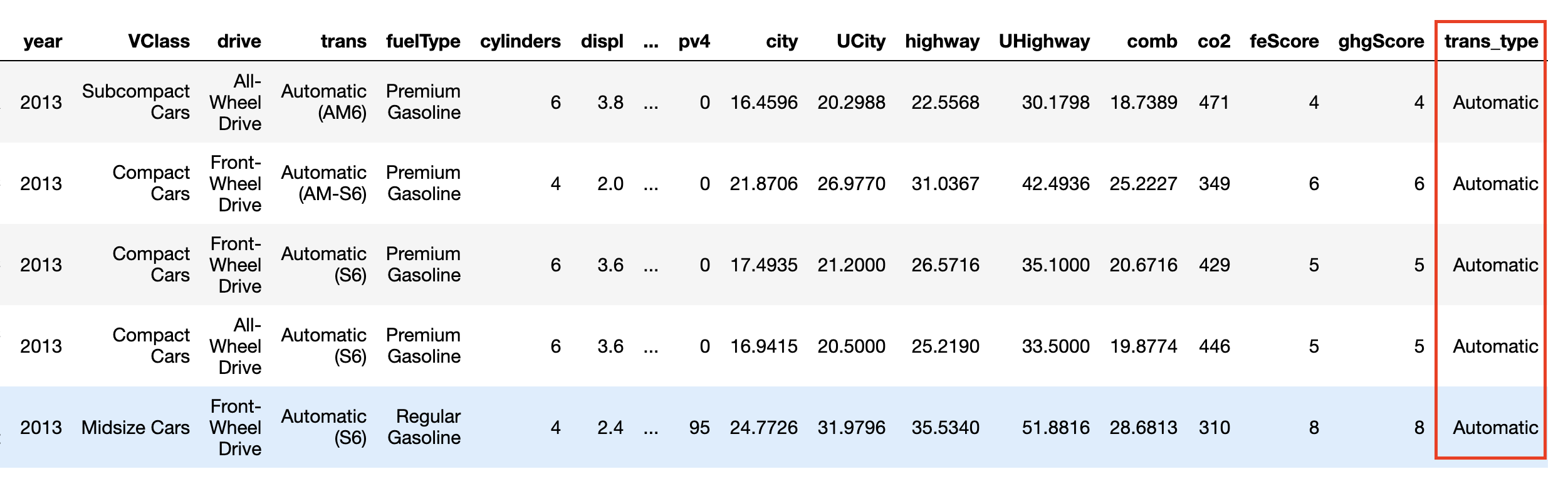
DataFrame after adding a new column trans_type
Step 3. Plot the bar chart
sb.countplot(data = fuel_econ, x = 'VClass', hue = 'trans_type')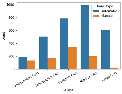
Bar chart between two qualitative variables, and one of them is ordered.
Alternative Approach
Example 2. Plot a Heat Map between two qualitative variables
One alternative way of depicting the relationship between two categorical variables is through a heat map. Heat maps were introduced earlier as the 2-D version of a histogram; here, we're using them as the 2-D version of a bar chart. The seaborn function heatmap() is at home with this type of heat map implementation, but the input arguments are unlike most of the visualization functions that have been introduced in this course. Instead of providing the original dataframe, we need to summarize the counts into a matrix that will then be plotted.
Step 1 - Get the data into desirable format - a DataFrame
# Use group_by() and size() to get the number of cars and each combination of the two variable levels as a pandas Series
ct_counts = fuel_econ.groupby(['VClass', 'trans_type']).size()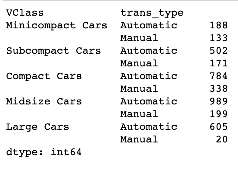
Number of cars in each vehicle type and transmission combination
# Use Series.reset_index() to convert a series into a dataframe object
ct_counts = ct_counts.reset_index(name='count')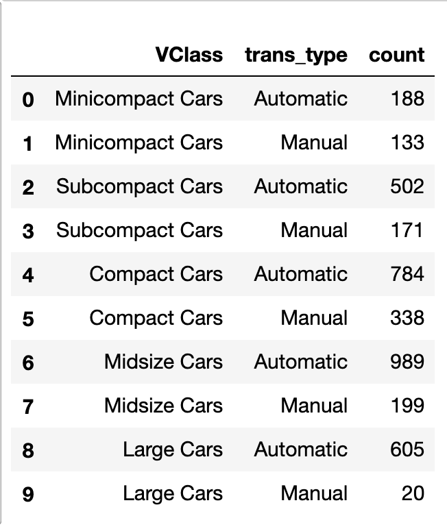
A DataFrame object created from the Series generated in the step above
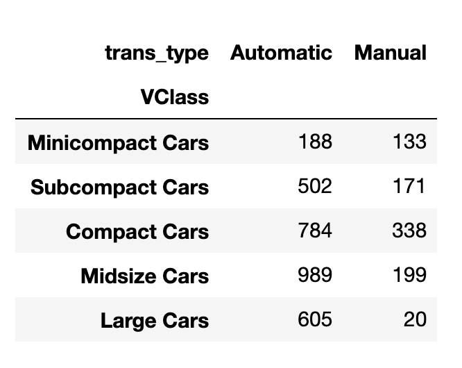
The DataFrame to plot on heatmap
# Use DataFrame.pivot() to rearrange the data, to have vehicle class on rows
ct_counts = ct_counts.pivot(index = 'VClass', columns = 'trans_type', values = 'count')
Documentation: Series reset_index, DataFrame pivot
Step 2 - Plot the heatmap
sb.heatmap(ct_counts)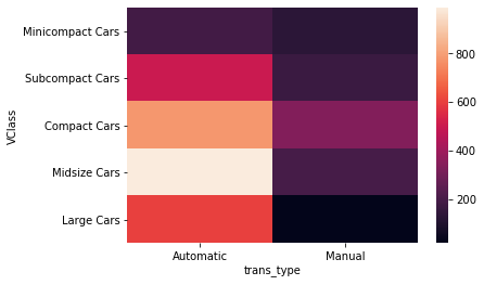
The heat map tells the same story as the clustered bar chart.
Example 3. Additional Variation
sb.heatmap(ct_counts, annot = True, fmt = 'd')annot = True makes it so annotations show up in each cell, but the default string formatting only goes to two digits of precision. Adding fmt = 'd' means that annotations will all be formatted as integers instead. You can use fmt = '.0f' if you have any cells with no counts, in order to account for NaNs.
